
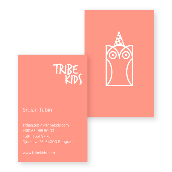
Tribe Kids was created based upon the concept of an interactive children’s classroom in nature. The visual language with which the brand identity is created relies on free form. The key elements of imagination and linear resiliency of the concept are also conveyed through the adaptability of the logotype itself, and how it works within different surroundings and environments.
In this way the sensibility of the brand is conveyed directly into the natural and marketing environments. The perception of the brand itself and its form gains a comparative advantage due to the fact that it doesn’t represent cemented principles of the market, but instead uses its content to create a more complete space which it intends to take within that market.
The symbol of the owl as a graphical element is used to accentuate the brand’s educational content and attributes; allowing for a sophisticated compatibility between the educational and fun elements within it - something which the brand in its very essence needs to emanate.