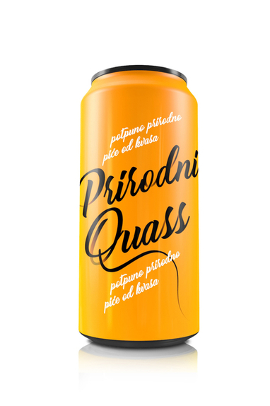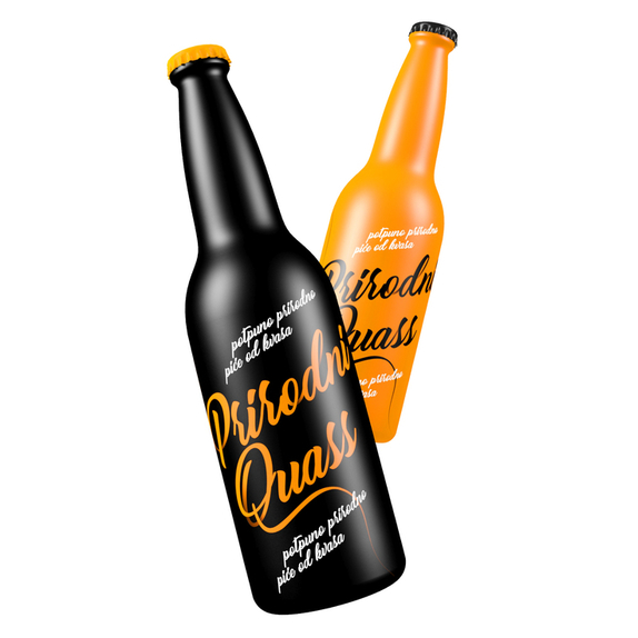
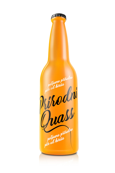
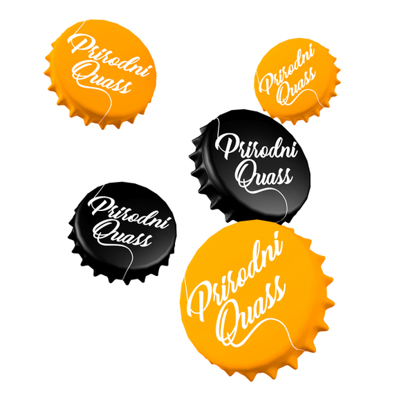
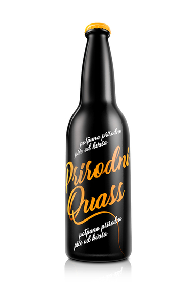

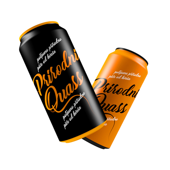

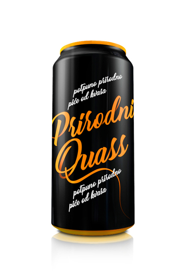
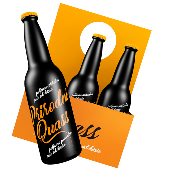
The brand Quass represents the creation of a refreshing non alcoholic beverage. In order for the brand to be completely recognizable on the market, it was created with a clean and dynamic typography, lacking any kind of potential additional ornamentation on the packaging. In this way, the logotype generates its strength as it represents only the essential; while all other attributes are created suggestively within the consumer themselves.
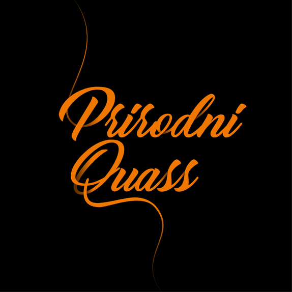
The logotype form in the application on the packaging leaves the viewers field of view, which in turn additionally suggests the dynamic elements of the product as well as the attributes the brand itself posses. The optic specter of the brand is created in a dissonant relationship between two complimentary colours. In addition to this, we paid particular attention to the way in which the logotype would reflect and behave in specific colour environments, whether in the positive or negative instance.
We insisted that the graphic language used for communication with potential consumers was simple and adaptable, allowing for the application of the logotype on most formats.
This type of flexibility which the brand represents within its graphic domain, is essentially synonymous with its ease of perception in different consumer groups and potential consumer circles. In this way, Quass becomes accessible to everyone, and therefore, its primary qualities are based upon the experiences and perceptions of potential consumers.
