

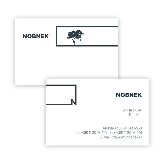
Nobnek is a construction company, primarily dealing with the development of residential housing and complexes. The brand was created having the company’s efficiency and reliability in mind; this is represented through the development of a simple but powerful graphic language.
The primary strength of the brand is found in its adaptability - the first letter ’N’ can be used in different contexts and applications, allowing for a dynamic form of communication while still retaining its magnitude through simplicity.
It shows the many aspects of the brand itself, as well as the discourses within which it operates, and so in this way, becomes even closer and more familiar with the consumer. In addition to this, the colour palette was chosen to convey a sense of vitality, combined with the graphic elements displayed, achieves a relatable atmosphere and connection within the viewer - a sense of professionalism and reliability is in this way cultivated, allowing for a more accessible interaction between the consumer and the brand. This in turn gives the brand its own sensibility and differentiates it from other competitors on the market.
