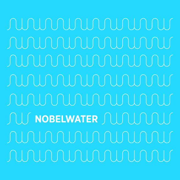
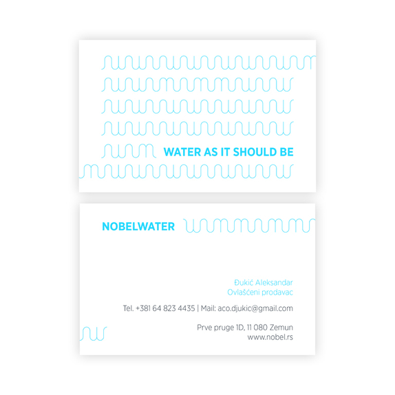
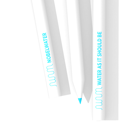
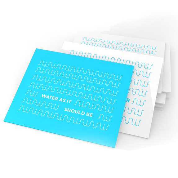
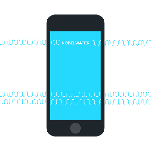
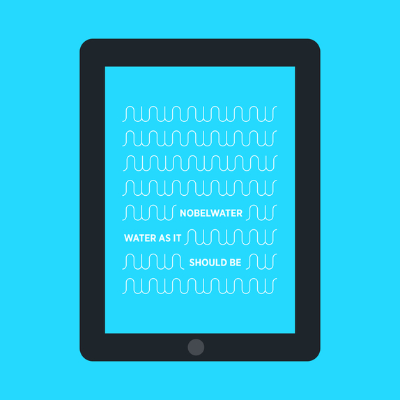
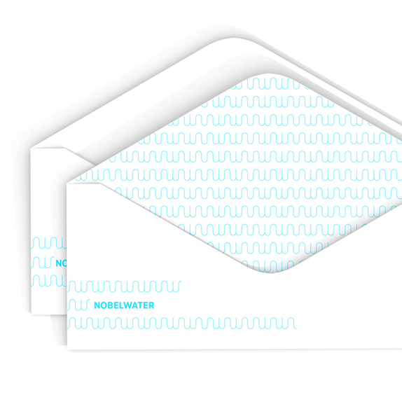

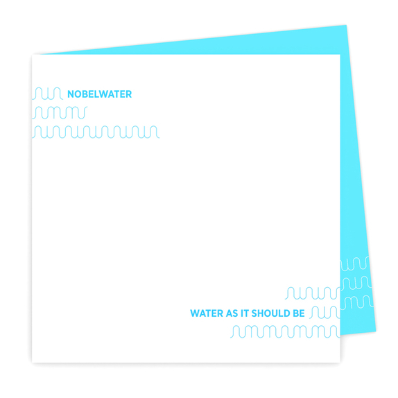
Nobel is a brand whose visual identity was created through utilizing the symbiosis of its first two letters. They are the foundation upon which the primary symbol was visualized; and through which it communicates the formal structure of a wave.
The symbols’ symmetry conveys an endless pattern, as well as the conquering of space, which is important in the context of contemporary marketing, as it allows the brand to be adaptive for both print and digital media communication. The brand’s suggestiveness is found within the dissonant tones between the typography and the symbol which accompanies it, as they convey a familiar graphic language in their communication.
The colour palette is derived from light tones of blue so as to achieve indirect identifiable notions with regard to both the approachability and clarity of the brand itself. The essence of the logotype is found within its geometric infinity, as well as its constructive expansion using the letters within the brand’s name.