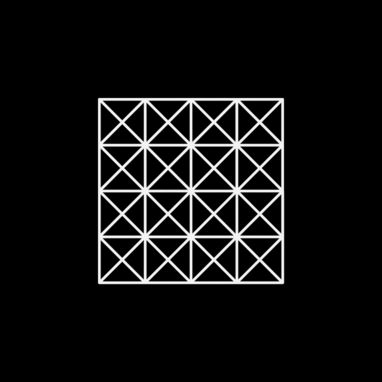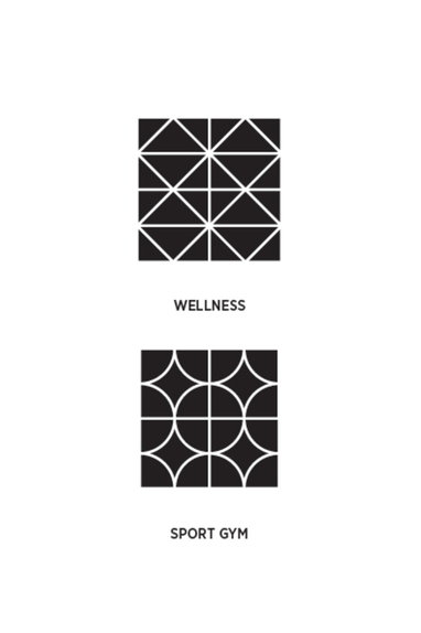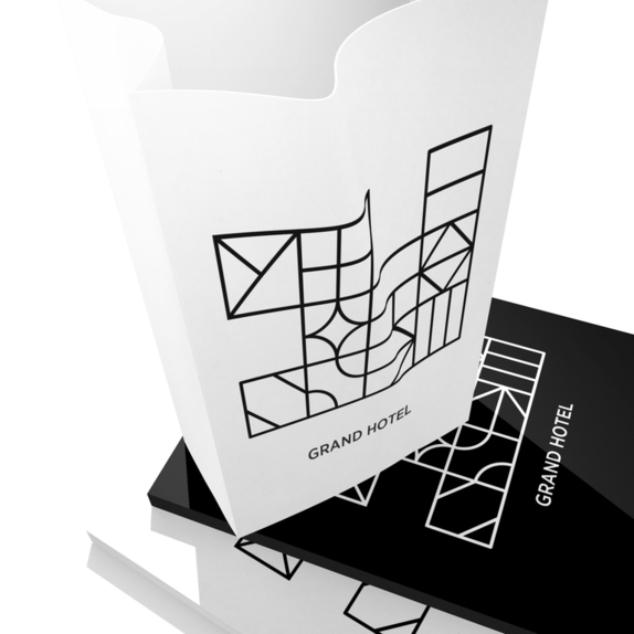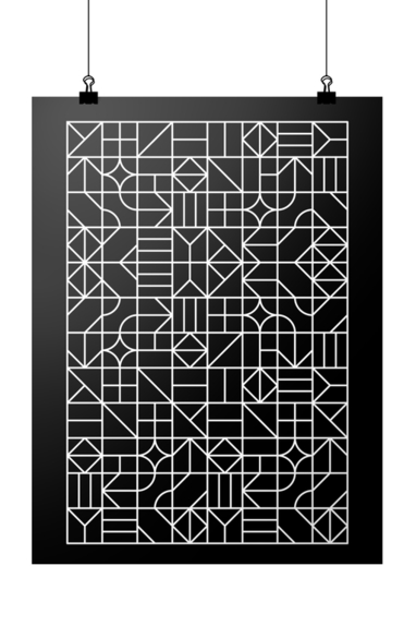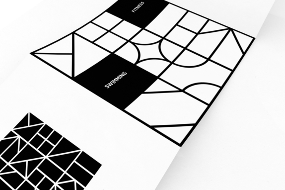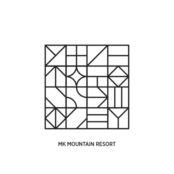
The main objective (of the project/intervention) was to create a convincing graphic solution, which would unify three different hotels under one brand. To achieve this, we employed simple geometric forms, easily manipulated in order to make a graphic interconnection and create a specific and unmistakeably recognizable shape.
Basic motifs were found in the ethnographic loom pattern of the area, and in the characteristic natural environment in which hotels are situated.
Basic motifs were found in the ethnographic loom pattern of the area, and in the characteristic natural environment in which hotels are situated.
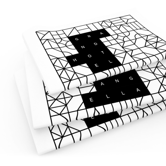
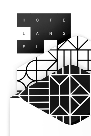
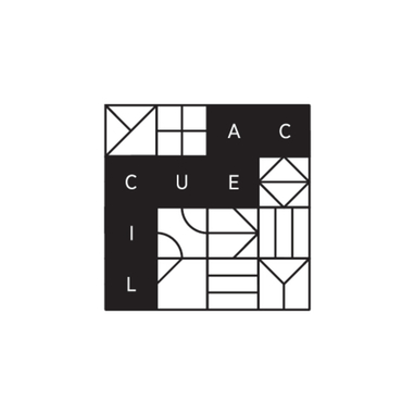
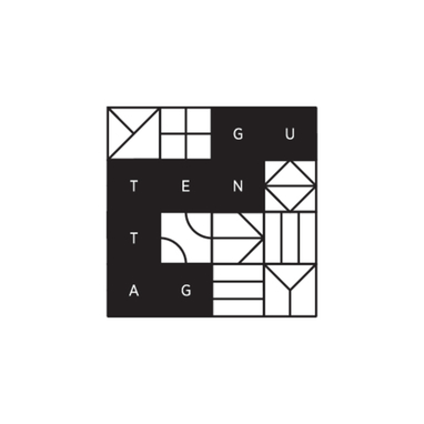
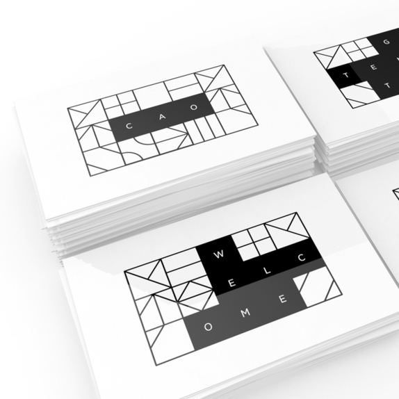
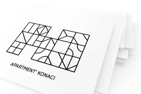
By stylisation of the motifs, we were able to create a modular form, suitable for adequate graphic presentation of the brand and its characteristics.
Because of its simplicity, it is possible to establish various aspects of graphic combinations, as well as to create the distinction between three different identities, while retaining the basic outlines of the mother brand.
Because of its simplicity, it is possible to establish various aspects of graphic combinations, as well as to create the distinction between three different identities, while retaining the basic outlines of the mother brand.
