The identity for Maestro was conceived in such a way for it to reflect the services the company offers - straightforward and efficient solutions in home care and maintenance.
The visual elements featured, symbolize this through clean, simple and direct illustrations.
The visual elements featured, symbolize this through clean, simple and direct illustrations.


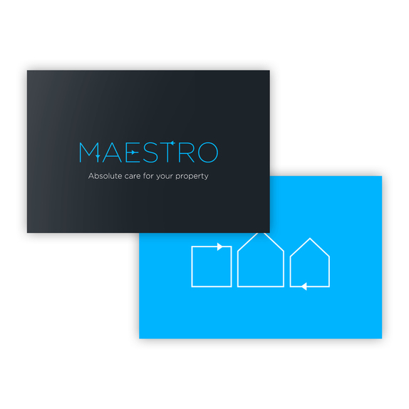


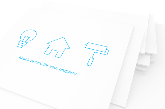
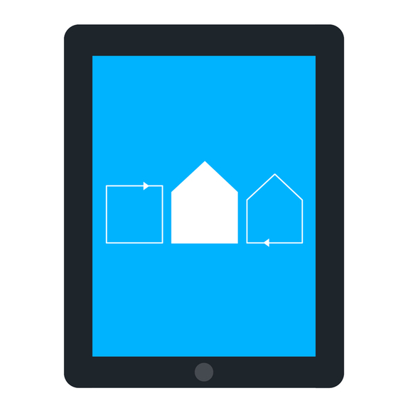
The primary logotype is an outline of a home, with the arrowhead conveying a cyclical, all around manner of house keeping, in which each element and part of a client’s home or property is taken care of.
The other symbols which can be seen are an extension which accompany this idea and develop it further - strengthening the notion that the client’s home or property is in expert hands, due to the fact that each system or department of their property is more than sustained.
The other symbols which can be seen are an extension which accompany this idea and develop it further - strengthening the notion that the client’s home or property is in expert hands, due to the fact that each system or department of their property is more than sustained.



ddd