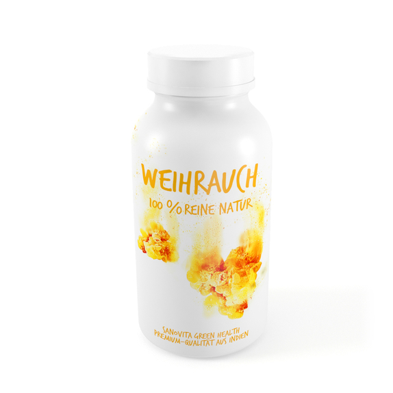
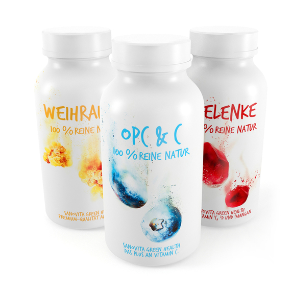

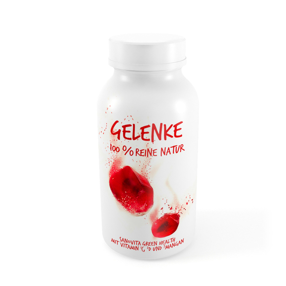

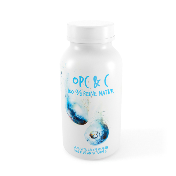


The brand Green Health is arises from dietary supplements. It bears its roots in the natural ingredients, which with their essential values, are the very foundation of the brand, found in its core.
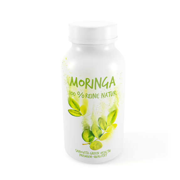
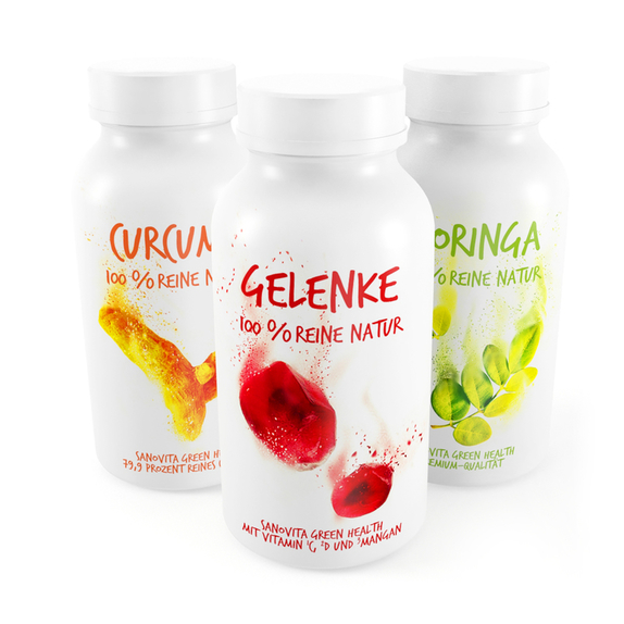
The graphic language applied on the packaging represents the transitioning of nature into its most essential form - it represents the brand synthesizing only the very best from nature as its final product.
In this way the brand is presented dynamically, as another comparative value is created by the product itself upon positioning itself on the market.
In this way the brand is presented dynamically, as another comparative value is created by the product itself upon positioning itself on the market.
The packaging of the complete range of products insists on a wide array of colour application; which in turn adds another fresh element to the brand, and further complements its distinctive look. This allows it to further stand out from products within the similar market.
