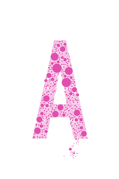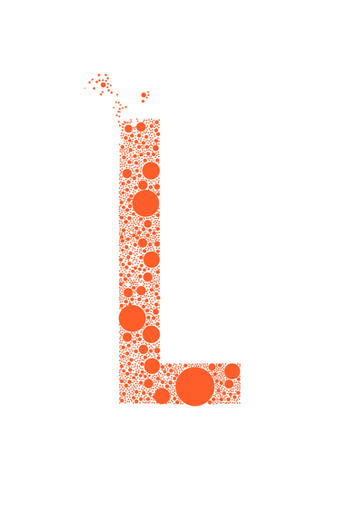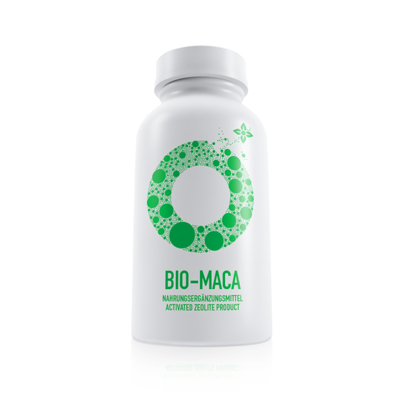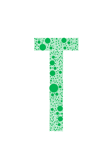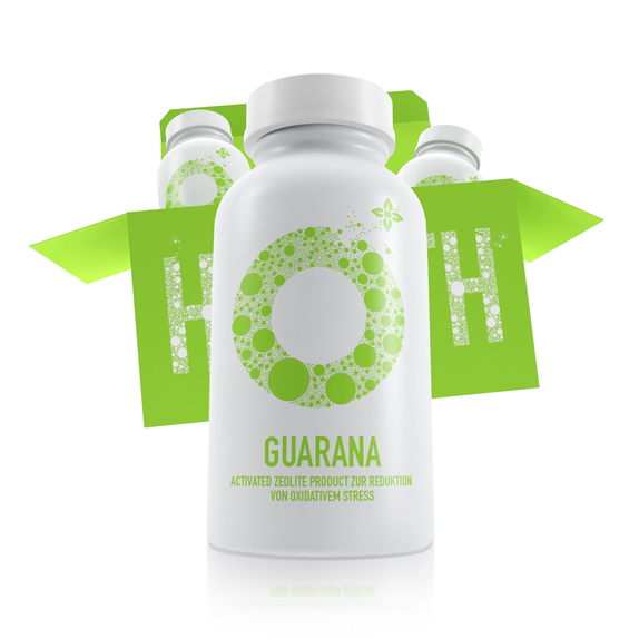

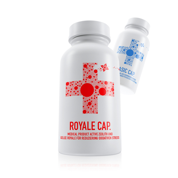
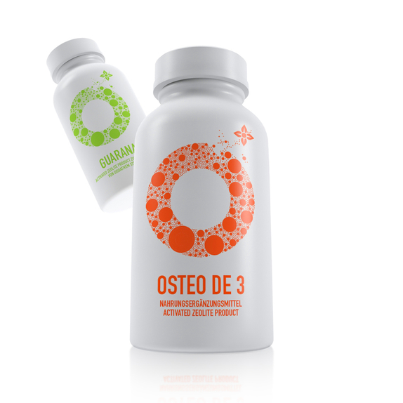
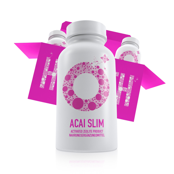
The brand Detoxamin was created out of the need to convey the true essence of nature, in its most natural and basic form, to man. The main component in the Detoxamin dietary supplements is zeolite, and the brand structure is based on its wide spectrum regenerative abilities which it has in every day dietary use. The graphic form was therefore created to represent the wide array of positive and healing characteristics which it has on the human metabolism.
The circle was chosen to be the main carrier of the brand due to its ease of legibility and general recognizable presence. Through its implementation, an adequate representation within the graphic domain is achieved in terms of bringing the brand closer to potential consumers. The link and association between symbols and terms is therefore achieved through combining the recognizable symbolism which is already prominent within the pharmaceutical industry, where the circle, with all its attributes, serves as a means for the intended message to be conveyed and communicated in the most efficient way possible.
The circle was chosen to be the main carrier of the brand due to its ease of legibility and general recognizable presence. Through its implementation, an adequate representation within the graphic domain is achieved in terms of bringing the brand closer to potential consumers. The link and association between symbols and terms is therefore achieved through combining the recognizable symbolism which is already prominent within the pharmaceutical industry, where the circle, with all its attributes, serves as a means for the intended message to be conveyed and communicated in the most efficient way possible.
