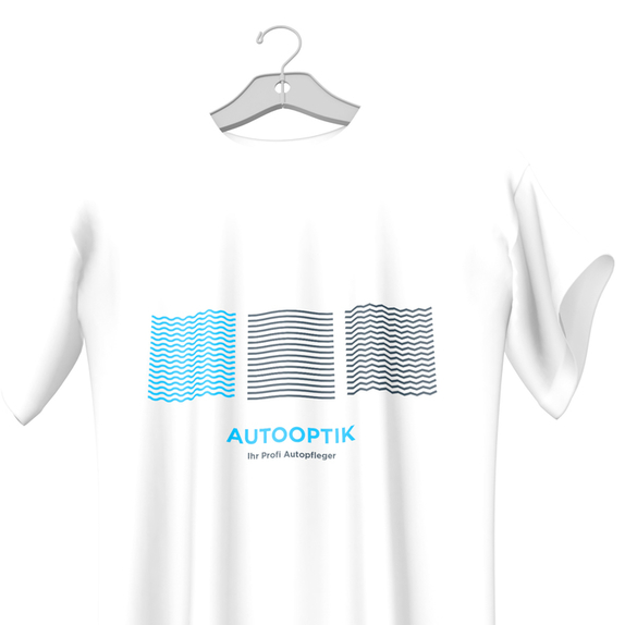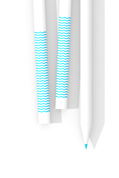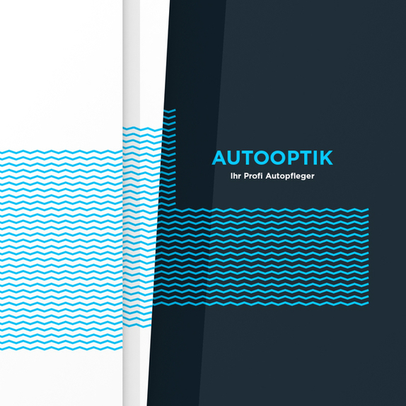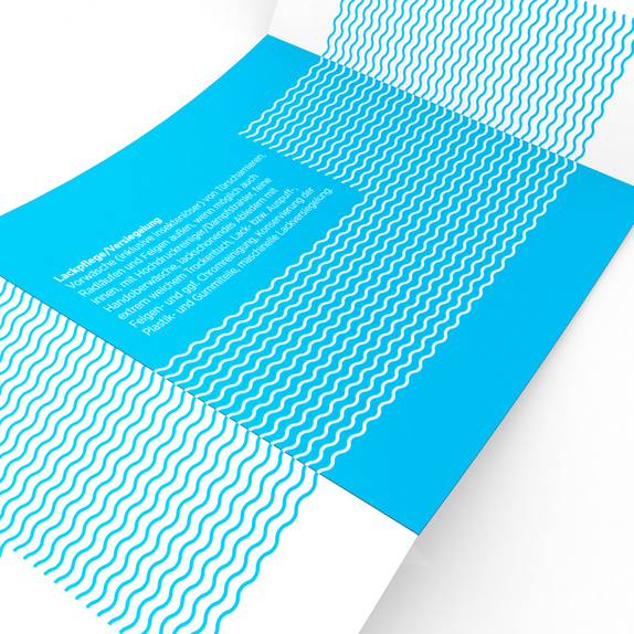
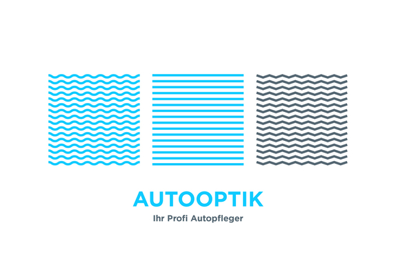
Here is the redesign of the logo and identity for the brand Autooptik.
The wave like lines found in the logotype as well as the elements which constitute the brand itself, are made to reflect the business characteristics of Autooptik’s operations.
The wave like lines found in the logotype as well as the elements which constitute the brand itself, are made to reflect the business characteristics of Autooptik’s operations.


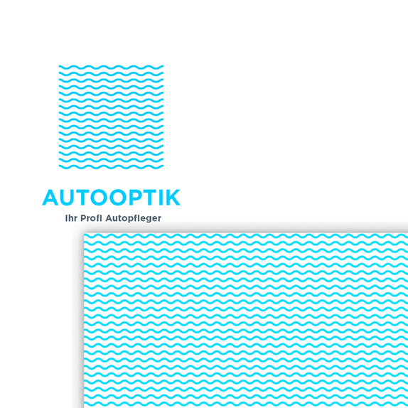
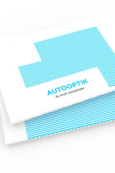
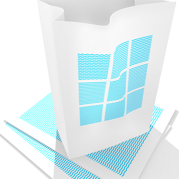
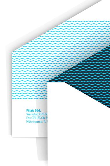
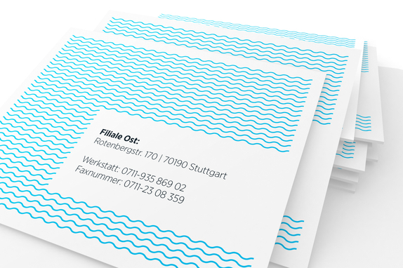
The fluidity and continuity of the lines represents and conveys the dynamic, energetic and fast paced nature of business, as well as communicating a sense of trust and support throughout the process.
