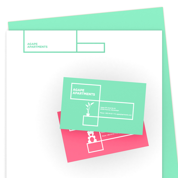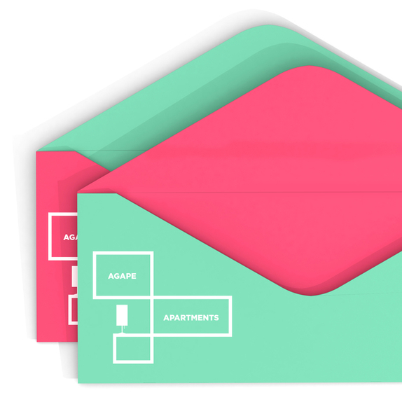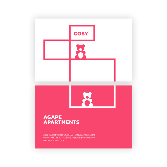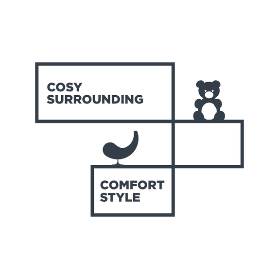
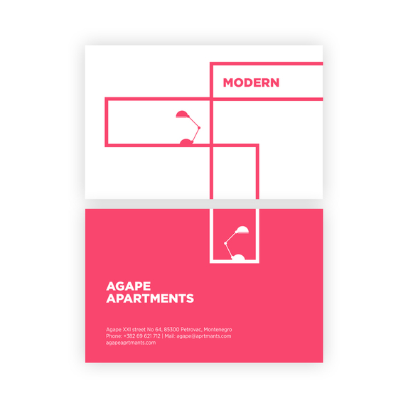
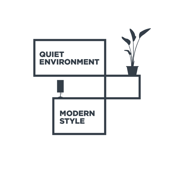
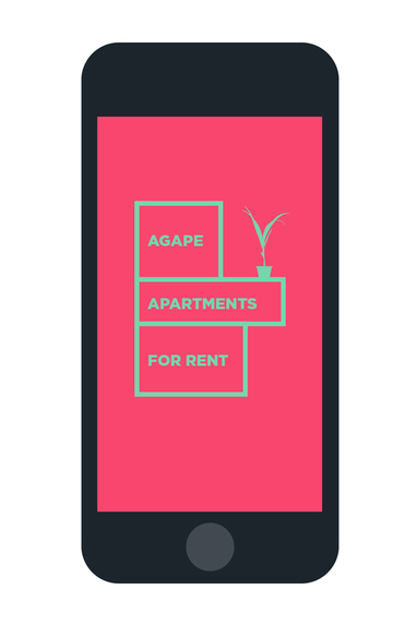
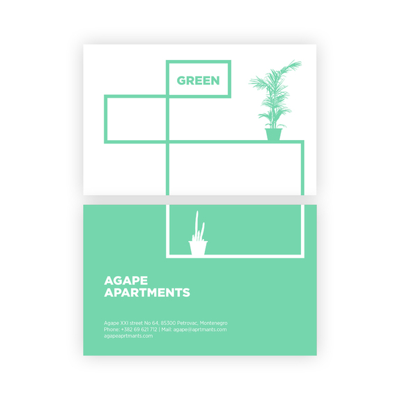
The brand identity was created through using the basic geometric forms and shapes predominantly found in architectural drawings. Their flexibility within application and visualization is found in the ability to cover all potential client needs.
In order to avoid strictly defined geometric forms from architectural blueprints, the brand is ornamented with pictograms which convey the comparative values of the logo itself; such as contemporary design, comfort and a green natural environment. In this way, a specific graphic language has been incorporated into the brand, allowing for adaptability for all communication channels and purposes.
The colour palette is inspired by the actual colours found in the environment and the surroundings in which the apartments are located; the colour correction which the logo has undergone is a direct result of having the aim to present the brand as best as possible within a digital environment.
